
Creating a graph
-
Go to your configurable dashboard page
-
Click 'Add graph or widget' button at the bottom of the page.
You can add any number of graphs to a single dashboard.

You will be presented with the option to select the type of graph or widget that you want:
 Select the graph option.
You will be asked to give the graph a name.

Renaming a graph
- Go to your configurable dashboard page
- Click on the overflow menu on the graph you want to rename.
- Click ‘Rename Graph’ option.
- Enter a new name.
- Click ‘Save’


Adding data to a graph
-
Go to your configurable dashboard page
-
Click on the overflow menu on the graph you want to add data.
-
Click ‘Add Data’ option.

You will now have the option to add data to your graph:
You can choose different data types to add to your graphs; sectors and individual sensors.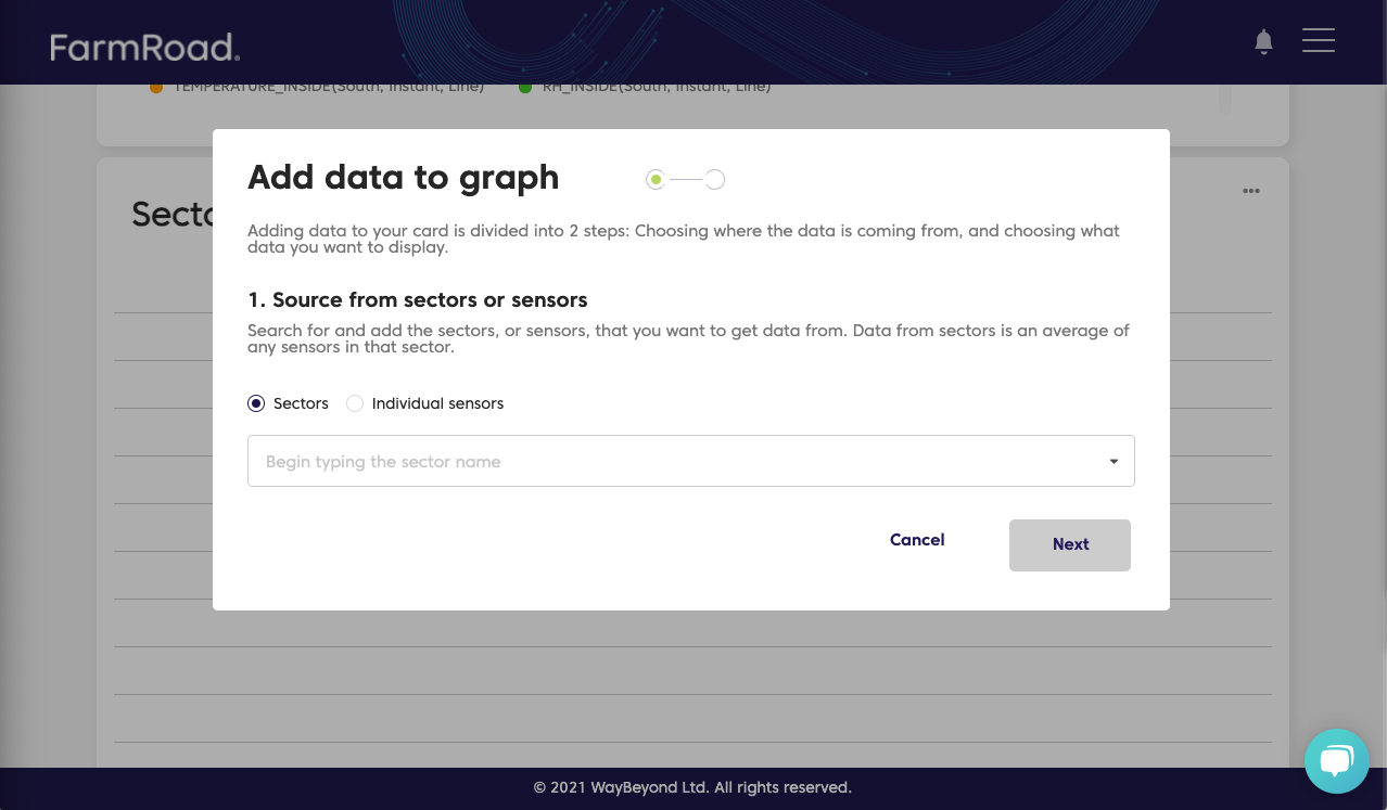
Sensor data
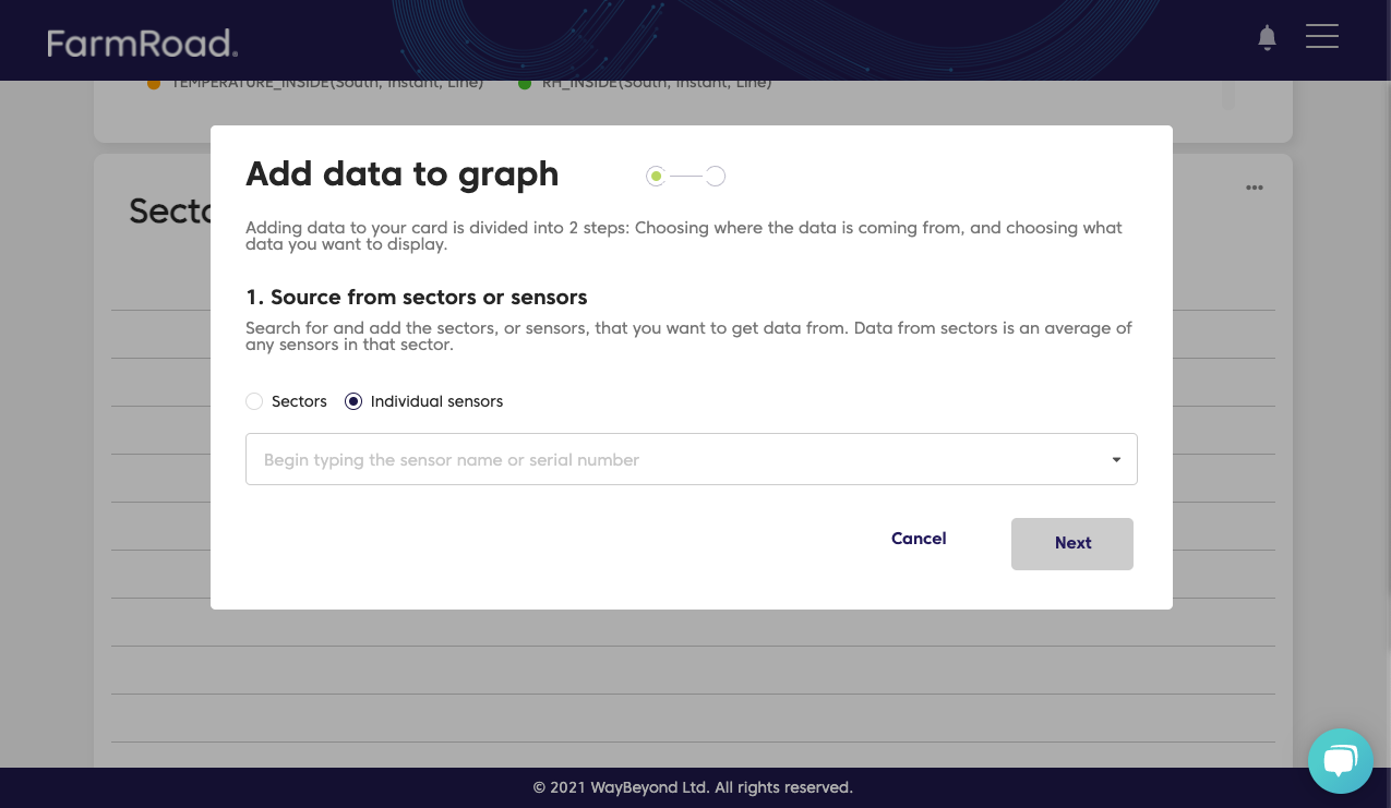
You can choose to graph data from multiple sensors that have been integrated into your FarmRoad account.
After choosing the sensors you want to graph, you will be asked to select the datasets that you are interested in: 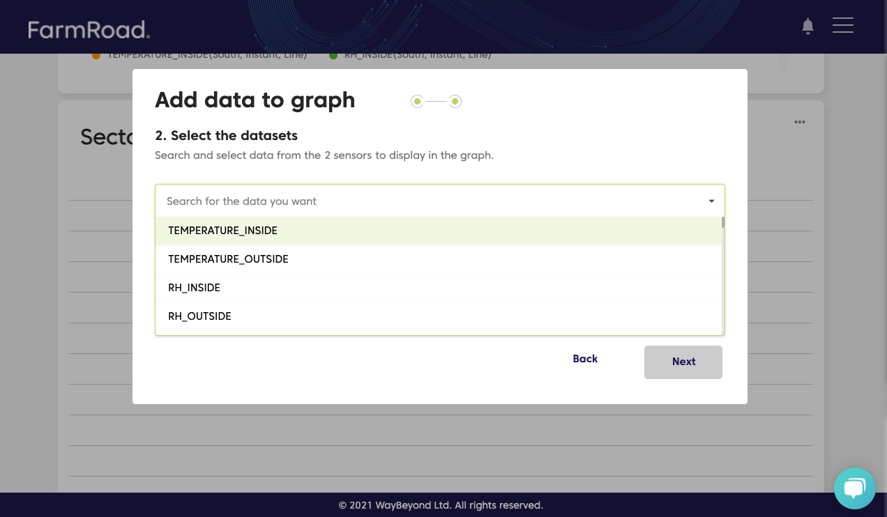
These datasets will display the raw data as it was received for the selected sensors.
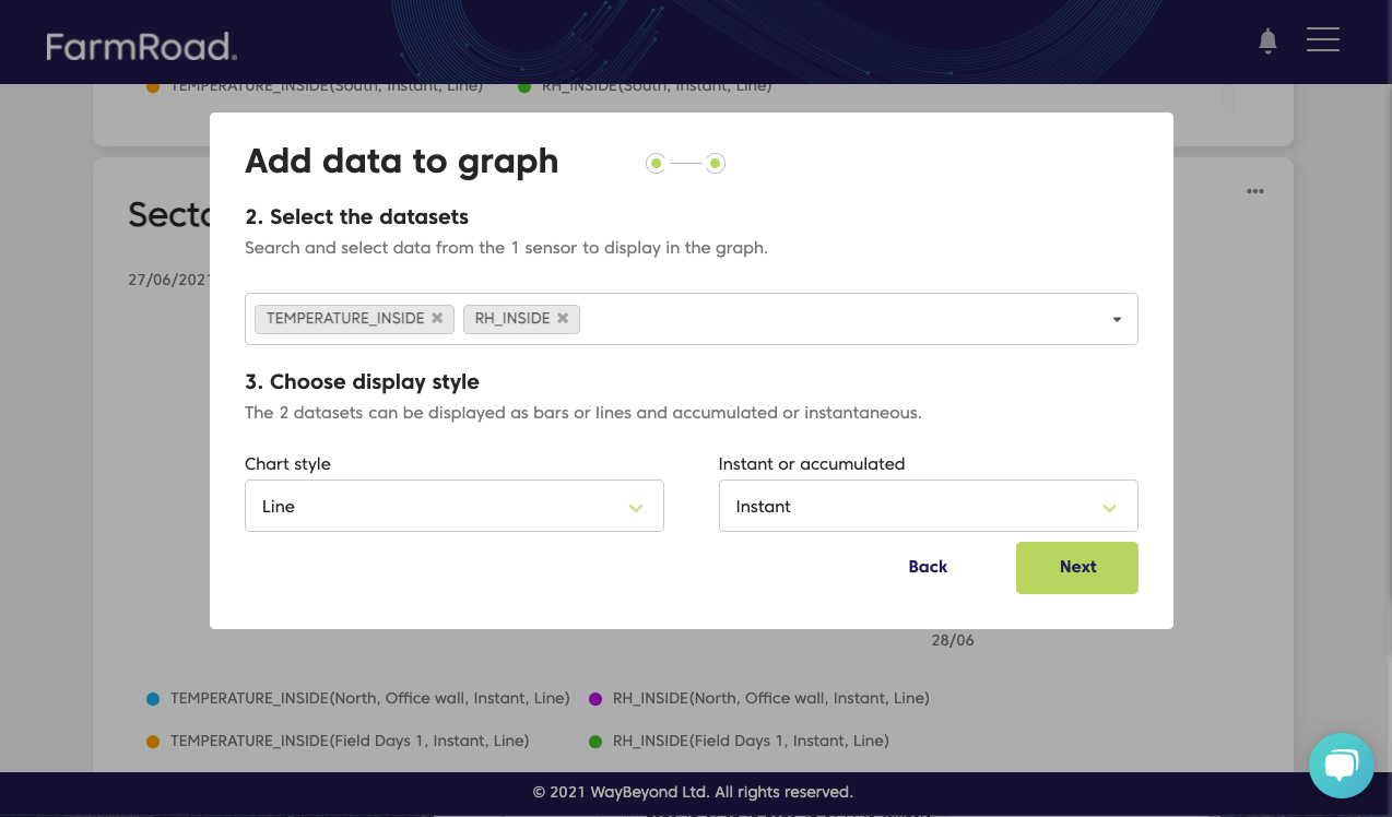
You also have the ability to choose how you would like your data presented.
- Select between 'line' and 'bar' to customize your chart style
- Select between 'instant' or 'accumulated'
- Instant readings will show the raw measurements that were recorded by the sensors
- Accumulated will add your measurements up over time. This is useful for graphing accumulated radiation or CO2
Sector data
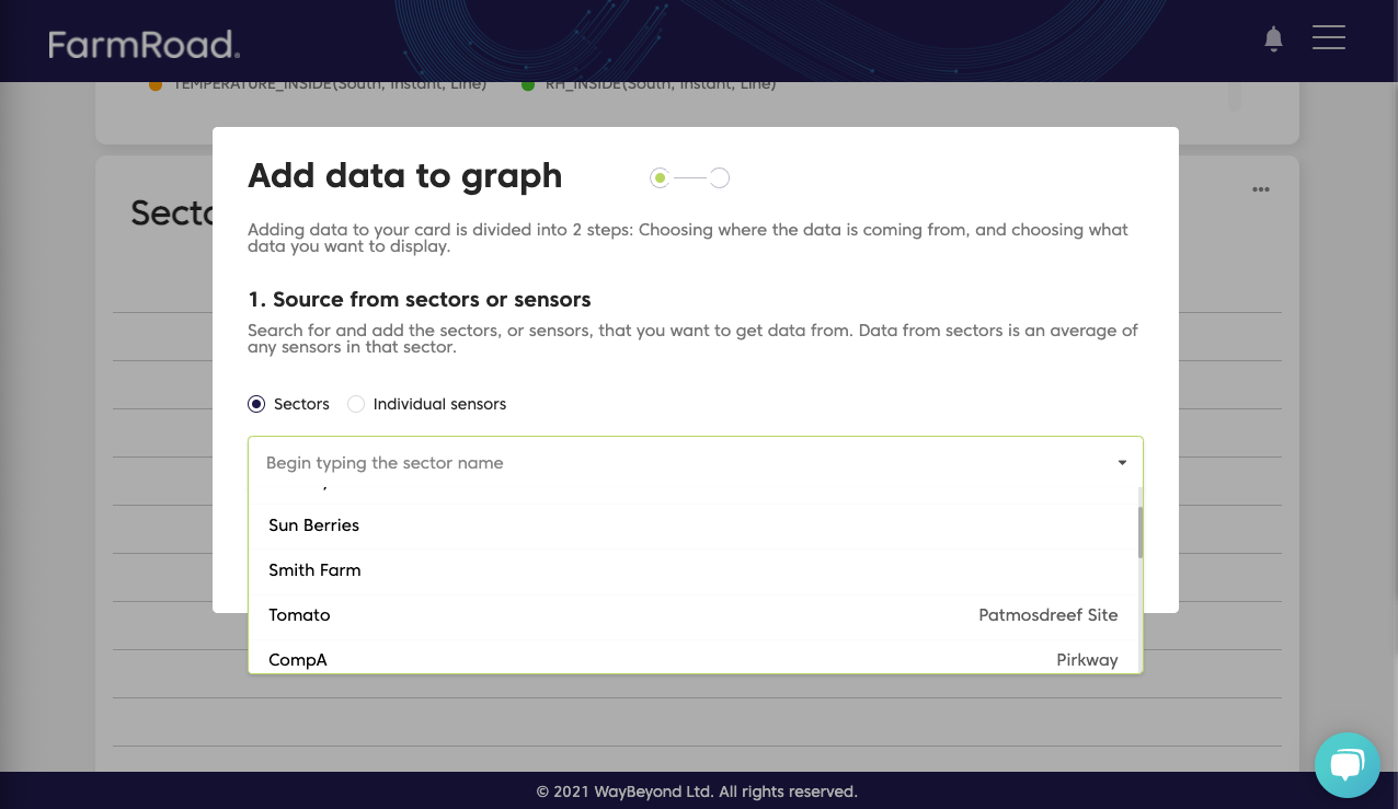
Any data that has been collected for a sector can be graphed.
If multiple data points during the same timestamp exist, the graph will average them out.
For example, if you have four sensors within one sector all collecting humidity readings, the system will calculate an average between the four sensors and present an average value for the whole sector.
Removing data from a graph
-
Go to your configurable dashboard page
-
Click on the overflow menu on the graph where you want to remove data.
-
Click ‘Remove Data’ option.
-
Deselect the dataset you want to remove from the graph.
-
Click ‘Done’.

Removing a graph
-
Go to your configurable dashboard page
-
Click on the overflow menu on the graph you want to delete.
-
Click ‘Remove Graph’ option.
-
Click ‘Remove’.

Viewing a graph
- You can select a new time range using the date picker
- You can hover over a graph to show a tooltip
- You can zoom in and out of the graph by clicking and holding the mouse button
- To zoom back out click the green icon

